Tuesday, June 2, 2020

Unemployment Insurance Claims Data Shed Light on the Local Economic Impacts of COVID-19 Public Health Directives


By Lyndsey Stram, Regional Economist; Lecia Parks Langston, Senior Economist


“You have power over your mind — not outside events. Realize this, and you will find strength.” Marcus Aurelius

In the wake of the COVID-19 pandemic, businesses lost revenues and workers lost jobs. But because of the time it takes to collect and collate data, economists have been left without much information to quantify the economic impacts at the local level.

But there is one ray of data illumination. Claims for unemployment benefits are promptly available and provide information about a large cross section of the economy. This post will outline what light unemployment claims data sheds on the state of southeast Utah’s economy.

While not all workers are protected by unemployment insurance laws, roughly 95% of jobs are covered. This makes claims data an exceptional source of information about the economy. Not included under unemployment insurance laws are most self-employed workers, about half of agricultural employment, unpaid family workers, railroad personnel (covered separately) and many nonprofit organizations (such as churches). Also, some out-of-work employees may not have worked a sufficient work history to qualify for unemployment insurance benefits, but may file anyway.

Fortunately, in this time of economic distress, the social safety nets of the unemployment insurance program, special national COVID-19 funding and social programs are working together to keep workers’ income and well-being stable.

Unemployment claimants and the unemployed; they aren’t the same

Also, keep in mind that, in addition to individuals drawing unemployment benefits, the unemployment rate includes those entering and re-entering the workforce and non-covered groups without current employment. This means the number of “unemployed” will be greater than the number of claimants. In “normal” times, only about 40% of the “unemployed” are claiming benefits.

The generally reported unemployment rate also has a work-search requirement. If you haven’t made any minimal attempts to find work, you aren’t counted as “unemployed.”

Watch this Space

While this analysis won’t be updated on a regular basis, new data will be added to the data visualization on a weekly basis allowing readers to check back for the latest information.

An Unprecedented Event

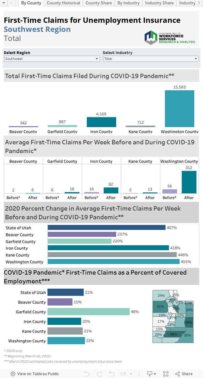
Not surprisingly, first-time claims for unemployment benefits soared in Utah and across the nation as the pandemic swept across the country. This increase is unprecedented since the creation of unemployment insurance coverage during the Great Depression. Week 12 (beginning March 16) marks the start of this unparalleled surge in claims. On a positive note, while new claims for unemployment insurance have skyrocketed in Utah, the state currently shows one of the lowest claims rates in the nation.

Most counties in the state saw the peak of first-time unemployment claims in weeks 13 and 14, 1-2 weeks after the COVID-19 pandemic hit, and this was true of San Juan County. Grand County however, with its large majority share of unemployment dependent on tourism related industries, saw a peak right away in week 12.

Another way to note the unprecedented flood of new claims is to look at weekly averages. Prior to the COVID-19 pandemic, southeast Utah averaged 23 claims per week. This has since increased to 227 average weekly first-time claims for unemployment.

Who took the hardest hit?

Counties with economies that largely depend on tourism are feeling the greatest economic and employment shocks in the state. This is true of Grand County, where 22% of the covered workforce has filed a claim for unemployment insurance in the weeks since the COVID-19 pandemic hit. San Juan also has some dependence on tourism but has only seen 11% of its workforce file, in line with the state average.

Tourism and COVID-19

Especially in the early stages of the restrictions, this is a story of tourism-dependent industries. More than 38% of COVID-19-related initial claims filed in southeast Utah represented workers previously employed accommodations and food services. In addition, the true effect of the pandemic on this industry is masked by a large number of claims classified as industry “unknown” in the early days of the claims flood. Undoubtedly, many of these claims would rightfully be classified in accommodations/food services if the appropriate information were available.

The High and the Low

Although accommodations/food services has generated the largest number of southeast Utah initial claims in the COVID-19 time period, in percentage terms, other industries have actually suffered more. For example, in the extremely small management of companies industry, roughly 70% of workers have filed for claims. The administrative support/waste management/remediation industries, which include temporary employment firms, shows a first-time claims rate of 52%.

Public administration however, has held onto higher portions of its workforce. Only 9% of the covered workforce in that sector have recently filed claims for unemployment. This is positive for southeast Utah where a large portion of the workforce is employed in this sector.

In many areas, healthcare/social assistance has made up for a large share of claims with the cessation of elective medical services. Southeast Utah has not seen this effect and much of that sector has remained employed.

County by County

Grand County
Prior to the COVID-19 pandemic, Grand County saw a weekly average of 13 first-time claims for unemployment. In the weeks since, this has increased to 169 average weekly claims.
Spring generally brings the start to the busy tourism season in Grand County, making the timing of the restrictions particularly impactful to the area. Nearly 500 claims (and probably well over if there was complete information for the unknown industry claims) were filed by workers previously in the accommodations/food services sector. Arts/entertainment/recreation also accounts for nearly 100 claims.
Transportation and warehousing are also important to Grand County. About 25% of the workers from that sector have also filed claims for unemployment insurance in the wake of COVID-19.
Before COVID-19 restrictions were enacted, Grand County made up for 57% of the region’s unemployment claims. This has since increased to 75%.

San Juan County
Prior to the COVID-19 pandemic, San Juan County saw a weekly average of 10 first-time claims for unemployment. In the weeks since, this has increased to 58 average weekly claims.
Although less dependent than its neighbor, Grand County, San Juan also depends on tourism spending during the summer months. Accommodations/food services accounts for the large majority of the first-time claims for unemployment in the county. As a percentage of the covered workforce in that sector, 23% of workers have filed.
Public administration is an important sector in San Juan County and a sector that has not yet seen major shocks from the pandemic. Only 3% of this large industry has filed claims in recent weeks.
Before COVID-19 restrictions were enacted, San Juan County made up for 57% of the region’s unemployment claims. This has since decreased to 25%.

Monday, March 5, 2018

Utah's Seasonally Adjusted Unemployment Rates

Seasonally adjusted unemployment rates for all Utah counties have been posted online here.

Each month, these rates are posted the Monday following the Unemployment Rate Update for Utah.

For more information about seasonally adjusted rates, read a DWS analysis here.

Next update scheduled for March 26th.

Friday, March 2, 2018

Utah's Employment Situation for January 2018

Utah's Employment Situation for January 2018 has been released on the web.

Find the Current Economic Situation in its entirety here.

For charts and tables, including County Employment, go to the Employment and Unemployment page.

Next update scheduled for March 23rd, 2018.


Wednesday, October 25, 2017

Economic Hurdles in Rural Utah

by Mark Knold

Utah is a geographically large state. Based on total area, it is the 13th largest state, implying there is room to spread out. Despite all this space, Utah’s population distribution is quite concentrated. According to the U.S. Census Bureau, Utah is the nation’s 9th most urbanized state. This dichotomy has shaped a state with two economic profiles — one urban, one rural. It can be challenging for a state dominated and prospering within the urban to extend its economic bounty to the betterment of the rural.

What is rural? It depends upon one’s objective behind the question. Most define rural by a visual scan of the landscape. A lot of open land and not many people — rural. Yet economically, the view can be different. An area may look rural, but if the economic vitality of its populace is strongly integrated with a nearby urban area, then this creates a different perspective. The latter is a preference of the federal government — an entity that often makes allocation or distribution decisions based upon economic factors.


No matter how one technically defines rural, the Governor’s Office recognizes a recent dichotomy in Utah’s economic prosperity. Since the Great Recession, Utah has had compelling economic success. Yet, most of this is concentrated in Utah’s urban centers. Portions of Utah’s rural communities are not seeing matching levels of success. Utah’s Lt. Governor recently observed, “Not all of Utah’s communities are full participants in this economic success. Many counties off the Wasatch Front are experiencing challenges.”

In response to this economic disparity, the Governor’s Office has launched the 25k Jobs initiative — an effort for businesses to create 25,000 new jobs in 25 Utah counties by 2020. With this spotlight on rural Utah’s economics, let’s take a look at some of these rural challenges.

To most, jobs deliver their income and means for living sustenance. Therefore, employment, and peripheral variables associated with employment, becomes the strongest proxy for measuring the Utah economy’s health. We will look at Utah’s counties through the lens of employment, unemployment, the labor force and how the industry structure speaks to the underlying performance of these variables.

A profile of job growth becomes a starting point. Economic performance needs to be viewed with a somewhat long lens. The Governor’s 25k Jobs initiative was not born from a short-term disorder, but instead is recognition of weak longer-term fundamentals. To illustrate this perspective, one needs to backdrop the short-term mechanics against the longer-term dynamics.

The County Job Profile chart is an intersection of the short-term trend with the moderate-term. Each county is a bubble, and the bubble size reflects job counts. The chart is divided into four quadrants. The quadrants tell the story of the intersection of the short and moderate-term trends (growth or contraction) and the general health of the county’s economy.


There are two axes of measure. First, the vertical axis represents the short-term. It is the percentage of county job change between 2015 and 2016. Above the horizontal axis is growth — below is contraction.

Second, the horizontal axis measures the moderate-term. It is the percentage of job change over the past five years (2011-2016). To the right of the vertical axis is growth — to the left is contraction. Where a bubble lies is the intersection of the short and the moderate term.

To illustrate, find Beaver County on the chart. Beaver aligns with around -4.0 percent on the vertical axis, and 8.0 percent on the horizontal axis. This says that over the past five years, Beaver County’s job count has grown by 8.0 percent, but over the past year it has contracted by around 4.0 percent. This implies that Beaver County’s economy may be slipping a bit. A one-year view would imply a problem. A longer-term view places this short-term setback against a broader perspective of overall prosperity.

The quadrant of concern is the Contracting quadrant. These economies have contracted over both the most recent year and the past five years. No matter how one wants to define rural as outlined above, all of these contracting counties identify as rural.

In-county jobs alone are not the complete picture. For example, a large percentage of Morgan County’s residents commute to Weber or Davis counties for work. If jobs are not being germinated in Morgan County, the county and its population can still prosper from its ties with the urban area.

An additional way to look at the economy is through the lens of the labor force. The labor force consists of those 16-years and older who are either working or looking for work. It is based upon where people live, not where they work. A worker living in Morgan County will be represented in Morgan County on the following chart (County Labor Force Change); yet, if they work in Weber County, their job is represented in Weber County on the prior chart. Adding this perspective helps to round out a county’s profile.

The structure of the County Labor Force Change graphic is the same as the prior chart. The area of vibrancy is the upper-right quadrant where the labor force is increasing. The quadrant of labor force contraction is the lower left. A decline in the labor force occurs when people become discouraged and leave the labor force — yet stay in the county, or when people leave the county altogether. Either way, a decline in the labor force signals a fundamental negative in the economic trend.

Depending upon the variables measured, a gain in one and a decline in another can both be positive. Job growth and an unemployment decline are both positive. To associate the positive with low unemployment, the quadrant message on the Unemployment Rate chart has been transposed.

Every month an unemployment rate is calculated for Utah and each of its counties. A county’s unemployment rate can be measured against the Utah statewide average unemployment rate. In the following graphic, county rates are mathematically compared against the statewide rate (seasonally adjusted), recorded and then summed across time.

For example, if a county’s unemployment rate is 5.5 percent and the statewide rate is 4.0 percent, then that county’s difference for that month is 1.5. If a county’s rate were to be 3.5 percent against the statewide rate of 4.0 percent, then the difference is -0.5. These monthly differences are tallied and summed. A high score speaks to a consistent and persistent unemployment rate above the statewide average. In other words, these are counties with a continuous environment of high unemployment.

The horizontal axis is a measure since 2000 and the vertical axis a measure since the beginning of the Great Recession (2008). The axis intersection is not at zero to isolate the “concern area” within the upper right quadrant. The statewide average is consistently close to the Salt Lake County average, so a sizeable number of counties will have sums slightly above the statewide average; yet, this doesn’t imply an unemployment problem. But the non-zero intersection is utilized to emphasize the counties that do have an outstanding unemployment disparity.

Across these various charts, a common group of rural counties emerge in the weak quadrant. These include Carbon, Emery, Garfield, Piute and San Juan counties; with Duchesne and Uintah hanging on the edge. There is a common theme that surrounds this grouping and it centers upon low economic diversity.

An economy’s ability to be consistently positive has a strong foundation in a diverse mix of industrial employment. Think of it in terms of “not putting all your eggs in one basket.” Economic diversity is spreading jobs across many baskets. Diversity is desirable because the overall economy is not dominantly influenced by one or a handful of industries whose poor performance weighs upon the whole.

A Hachman Index is an evaluation tool measuring to what degree an economy may or may not have all its eggs in one basket. In the Hachman Index, a measure of 1.0 means your eggs are well distributed across many industries. Conversely, numbers approaching zero point to a high concentration in one or a handful of industries.


Many of the counties that score low on the previous charts are the same ones on the lowest tier of the following Hachman Index chart. This chart represents the placement of economic diversity upon employment change of the past five years. A county will be placed high or low (vertical axis) on the chart depending upon its Hachman Index score. It will align right or left (horizontal axis) depending upon its five-year employment change. Metropolitan counties have higher economic diversity than rural counties — placing them higher on the chart. They are also further to the right on the chart, showing stronger employment growth. There can be individual exceptions, but the general theme is that lack of economic diversity is a foundational impediment to economic viability. Industrial diversity, though difficult to artificially induce, is a desired remedy to counter sluggish economic performance.

Lack of diversity does not mandate a poor economy. A reproduction of this chart five years ago would have placed Uintah and Duchesne counties still low on the chart, but their five-year growth rates would have been off the chart, needing arrows to point out beyond the chosen 40 percent horizontal axis limit.

Those economies are dominated by energy production. When energy prices are high, their economies can soar. When energy falters, they often do likewise. They are striking examples of economic outcome being determined by a dominant industry.

In summary, there is a dichotomy within the Utah economy between urban and rural. The urban economies are diverse and, therefore, more economically balanced; while many rural economies are not. With some rural counties the economic distinction is not a wide divide; but in the rural counties where the divide is pronounced, the underlying theme is often a low level of economic performance.

Tuesday, August 1, 2017

A Look at the Retail Trade Industry in Eastern Region


Consumer spending makes up around 68 percent of the nation’s gross domestic product. Consumer spending is individuals and families purchasing groceries, clothing, recreation, stocks, insurance, education and much more. The transactions cover a broad swath of economic activity.

Much of the nation’s consumer spending is captured via retail trade. A useful retail trade definition is “the re-sale (sale without transformation) of new and used goods to the general public, for personal or household consumption or utilization.”[1] Not all consumer spending is captured through retail trade transactions, but a large share is.

Broad-category examples of retail trade sectors are motor vehicle sales, furniture stores, electronic stores, building material stores, grocery stores, pharmacies, gas stations, clothing stores and department stores, among others.

Then there is the relatively new and emerging part of the retail trade sphere — non-store retailers. These are establishments that sell products on the internet. Examples include Amazon, Zappos, Overstock.com, or eBay. These types of retailers have grown rapidly in the past 15 years and their presence is reshaping the retail trade landscape.

Whereas in the past nearly all retail transactions were done through traditional brick-and-mortar stores, now a significant and growing segment is diverted to internet sales. The consumer shops online and FedEx (or like) delivers the product. One can see that the number of brick-and-mortar stores and the level of local sales across the country are being endangered by this economic evolution.

The brick-and-mortar reduction is beginning to show its economic presence in the United States employment numbers. While the U.S. economy is finally expanding at a healthy pace this side of the Great Recession, one of the few industries not rising with this tide is retail trade. While overall retail sales are increasing, employment is not.

Traditionally, as a population increases, retail trade employment grows simultaneously, since population growth and consumer spending volume is an integrated dynamic. If studied deeply, a certain ratio of retail trade employment growth spawned from population growth would emerge. Before the internet, the vast majority of all consumer sales occurred in the immediate community or region. But now, the internet is diverting these sales away from the local community — and with internet sales growing, its market share will increase.

We do not yet know how much brick-and-mortar erosion will eventually occur. And will such a phenomenon hit some areas more than others (e.g., urban vs. rural, or local vs. tourist spending)? These are touch points that economists will be watching as this internet sales phenomenon continues to grow within the national and Utah economies.

In light of this change, in this quarter’s Local Insights we are profiling retail trade employment throughout Utah’s local regions. This can offer a profile of where retail trade is now in a local economy, and possibly how much of the sector could become vulnerable to the internet-sales phenomenon.

All regions can be viewed through the Local Insights web portal. The following is a retail trade profile for the Eastern Region:

Non-store Taxable Sales Are Gaining, But Not as Fast as Employment. Why?

Taxable sales in non-store retail have not gained as a share of total taxable sales as quickly at the employment share has increased. This is primarily due to the fact that sales taxes are collected by the state of the purchaser, and then, only if the seller has a physical presence in that state. This means that when BackCountry.com sells a rug to someone outside of Utah, there is money coming into Utah (in terms of the jobs that the sale supports), but there is no sales tax coming in to Utah. The only non-store sales taxes captured in Utah are Utah consumers purchasing goods from retailers with a presence in Utah. Since large shares of sales by local online retailers are to customers in other states, it means that sales tax revenue lags compared to employment growth in the industry.

About NAICS

In order to explore the relationship between internet and brick-and-mortar retail we need to look at data grouped through the North American Industry Classification System (NAICS) , which “is the standard used by federal statistical agencies in classifying business establishments.”[2] Stated simply, NAICS groups businesses together based upon what they do.

Hierarchical in nature, NAICS begins with a broad categorization and narrows its focus through subsector levels. As an example, the educational services sector includes all institutions focused on providing instruction and training. At the subsector level, the focus narrows to elementary schools, colleges and trade institutions, etc.

The broad sector known as retail trade includes several underlying categories, such as motor vehicle sales, furniture stores, electronic stores, building material stores, grocery stores, pharmacies, gas stations, clothing stores and department stores, among others.

Then there is the relatively new and emerging part of the retail trade sphere — non-store retailers. These are establishments that sell products primarily on the internet or through direct selling. Examples include Amazon, Overstock.com, Young Living and dōTERRA. These types of retailers have grown rapidly in the past 15 years and their presence is reshaping the retail trade landscape. We will look at an illustration of this in a later section.

Internet sales have increased dramatically. Data from the Federal Reserve shows that internet sales are 8.5 percent of total retail sales as of January 2017. Nationally, retail’s 2016 share of employment is 11.2 percent. It is important to note that NAICS classifies businesses by what they do at a location, rather than by their business model. For example, the BackCountry.com location in West Valley City is classified under warehousing since that location is a warehouse.

Back to the East

In the Eastern Region (Carbon, Duchesne, Daggett, Emery, Grand, San Juan, and Uintah counties) retail trade is correlated with commodity prices because of the areas reliance on mining. When prices are high there is more discretionary income in the community, therefore more retail sales; and, correspondingly, retail establishments expand to meet demand. The reverse happens when commodity prices decline, slowing the economy and reducing discretionary income, therefore lowering retail sales and potentially retail employment.

The commodity-dependent industries can expand and shrink their employment in large quantities. When these industries’ employment increases, so then does retail trade employment. But commodity-dependent industries can grow so rapidly that their share of total employment also grows rapidly. Even though retail trade employment goes up, it does not grow as rapidly; and, therefore, retail’s share of total employment actually declines.

Retail sales in the Eastern Region also differ from the national archetype because of broadband internet usage. The Pew Research center estimates that there is a 10 percent “gap” in broadband access between urban and rural internet users. This impacts the ability of Eastern Region residents to purchase goods on-line and forces them to rely on “brick and mortar” stores.

The composition of the retail trade labor force in the Eastern Region is now different than for the state as a whole. Utah’s retail trade labor force has greyed significantly over the past 15 years. In 2001, 11 percent of the labor force was under 18 while 8 percent was older than 55. As of 2016, only 3 percent of the sector’s labor force was under 18 while 16 percent was over 55. Unlike the state as a whole, the age composition of the Eastern Region has remained unchanged from 2001; the share for workers under 18 was, and still is, 13 percent. The analogous figure for workers older than 55 is 26 percent.

Conclusions

Traditionally, “retail follows roof tops.” Retailers try hard not to oversaturate given an area’s population. It follows that the ratio of retail-employment-to-population should fall over time. Given internet competition, it takes more people to generate the same amount of retail sales. The state data seems to weakly support this hypothesis. The statewide share has fallen by 0.4 percentage points since 2001, hardly an indication of a “retail apocalypse.” Surprisingly, the share in the Eastern Region has fallen by 0.6 percentage points. Analysts speculate that the larger decline is influenced by incomes in the Eastern Region’s energy-based economy. Internet purchases are positively related to income, and energy economies have greater income than agricultural-based economies. Further, because of the internet, consumers in Vernal or Roosevelt has infinitely more choices than they did a decade ago.

Perhaps the state’s recent agreement with Amazon will be helpful in unraveling this puzzle. Amazon recently established a nexus with the state of Utah and therefore became obligated to collect Utah sales taxes. Amazon reportedly captured 33 percent of all U.S. online purchases in 2015, according to the magazine Internet Retailer, up from 25 percent in 2012. In response to this development, revenue estimators for Salt Lake County have added a half percentage point to their estimate for 2017 sales tax collections. It will be interesting to see how Amazon’s actions will impact the Eastern Region.


Wednesday, May 3, 2017

Census Bureau Tool Provides Labor-Force Insight for Utah

Across the United States, jobs are quantified through each state’s unemployment insurance program. Those programs provide the potential for laid-off workers to receive unemployment benefits — the goal being to bridge the gap between workers’ lost jobs and their next jobs. An eligible recipient’s weekly benefit amount is based upon their earnings from recent work. This begs the question, how does Utah’s unemployment insurance program know how much an individual recently earned while working?

That answer is supplied by all businesses that hire workers, as they must report their employees and pay as mandated by the unemployment insurance laws. Companies identify their individual workers and those workers’ monetary earnings for a calendar quarter. As businesses are identified by their industrial activity and geographic location, it is through the unemployment insurance program that aggregate employment counts by industry and location are calculated.

Yet each state’s profiling of individuals is quite minimal in the unemployment insurance program. The U.S. Census Bureau can bring more light to the overall labor force by supplementing said information with gender, age, race/ethnicity and educational attainment (imputted from American Community Survey responses) for Utah’s labor force.

The Census Bureau packages this information through their Local Employment Dynamics program and makes available said data on its website. Here at the Department of Workforce Services, we recently downloaded and packaged Utah-specific data from said website and summarized it in the attached visualization.

Various data “tabs” are available, presenting Utah’s economy from different angles, ranging from industry shares within the economy to the age-group distributions of the labor force, to gender and race distributions. These labor variables can be viewed for the state as a whole, or by each individual county.

Some statewide highlights:

Industry — industrial distribution is quite diverse, which provides strength within the economy. Distributions do fluctuate with time, with manufacturing seeing its share lessen while health care and professional and business services shares have increased.

Age — the bulk of Utah’s labor force is composed of 25- to 44-year-olds. Older worker shares have increased over the past 15 years, yet still remain a non-dominant portion of Utah’s labor force. The youngest segments of the labor force declined noticeably during the Great Recession due to less participation, and that trend remains.

Educational Attainment — turnover rates are understandably highest with workers under the age of 25 as they strive to build their educational foundation and also find their niche in the labor market. A trend does stand out where the more education that a worker attains, the lower the turnover rate businesses experience from said educational classes.

Race/Ethnicity — Whites account for around 80 percent of Utah’s labor force. The Asian community is small but slowly increasing in share, and is also characterized with the lowest turnover rate and the highest new-hire wages.

Gender — males comprise about 55 percent of Utah’s labor force. The female share of 45 percent is higher than the national average. Roughly 35 percent of working females work part-time compared to 15 percent for males. Therefore, female new-hire wages are considerably lower than male new-hire wages. (Note: employer reporting into the unemployment insurance system is not hourly wage rate reporting but instead total calendar quarter wages paid. Therefore, calculations can only be made upon total quarterly wages, and part-time employment weakens this measure).

As for the various counties in the region, here are some labor highlights:

Grand The share of leisure and hospitality sector jobs has grown since 2000. In 2000, the share was 40 percent. It increased to 46 percent in 2015. Public administration jobs became a smaller part of the economy as its share decreased slightly from 5 percent to 4 percent. The share of construction jobs has shrunk. In 2000, the share was 8 percent. In 2015, the share had decreased to 5 percent. The age of the workforce has increased markedly. In 2000, 32 percent of the workforce was 25 or younger. The current share is 19 percent. Paradoxically, the share of workers with a high school diploma or less has actually increased. In 2000, this group comprised 41 percent of employment. The 2016 number is 32 percent. The workforce, while still overwhelmingly white, has become more diverse. The minority share of jobs grew from 15 to 20 percent between 2000 and 2015.

San Juan Trade has shrunk as a share of total jobs. In 2000, trade jobs made up 13 percent of the base. That number had decreased to 7 percent by 2015. Conversely, the health care sector has expanded dramatically. This sector has increased from 10 percent to 17 percent from 2000 to 2015, In 2000, 30 percent of the workforce was 25 or younger. The current share is 19 percent. However, unlike most other eastern Utah counties, the share of workers with a high school diploma or less has remained relatively stable.

Friday, April 7, 2017


The word 'Utah' means 'top of the mountains' and is derived from the Ute Indian language." --From a Utah tourist brochure dated June 1955.

"The word 'Utah originated with the people inhabiting that region..of the Utah nation, which belongs to the Shoshone family. There were many tribes...There were the Pah Utes...and many others. Pah signifies water. ...Pah Utes, Indians that live about the water." --from Hubert H. Bancroft's "History of Utah." published in 1964.

"Utah comes from the Ute tribe and means 'people of the mountains." --From the Information Please 1994 almanac.

"Utah -- from a Navajo word meaning upper, or higher up, as applied to a Shoshone tribe called Ute. Spanish form is Yutta. English is Uta or Utah." --From The 1979 World Almanac and Book of Facts.

These quotes compiled by the Utah Education Network website show that we are still not sure where the  state’s name came from but fairly certain that it originated with the state’s indigenous peoples. There are roughly 32 thousand Native Americans in Utah, or a little over 1 percent of the population.

There are eight federally recognized Indian tribes in the state:

·         Confederated Tribes of the Goshute Reservation (Nevada and Utah)

·         Navajo Nation (Arizona, New Mexico and Utah)

·         Northwestern Band of Shoshoni Nation 

·         Paiute Indian Tribe of Utah  (Cedar Band of Paiutes, Kanosh Band of Paiutes, Koosharem Band of Paiutes, Indian Peaks Band of Paiutes, and Shivwits Band of Paiutes)

·         Skull Valley Band of Goshute Indians of Utah

·         Ute Indian Tribe of the Uintah and Ouray Reservation

·         Ute Mountain Ute Tribe (Colorado, New Mexico and Utah)

These tribes are distributed across the breadth of Utah with concentrations in the eastern and southwestern parts of the state. There is also is significant Native American presence along the Wasatch front population centers.
The Department of Workforce Services has just published an interactive graphic detailing demographic information about Utah’s Native American population. The visualization has six tabs. Unlike other department graphic tools, it has a principal focus on raw numbers rather than proportions because of the huge disparity in populations at the county level. For example there are thousands of Native Americans in San Juan County but only one person in Rich County.
The first tab presents median earnings defined as compensation from all employment plus other sources of income. This is a useful measure when comparing the income of workers who may receive non-wage income from the sales of agricultural products or bonus income from the sale of tribal natural resources. The number of counties is limited because of the paucity of reliable data in counties with small Native American populations.  Statewide, full time males earn slightly less than their national counterparts. The same is true for female Native American Utahns. It must be noted that Utah tribes are geographically disadvantaged when compared to their Pacific and eastern peers; tribal seats are far from the major population areas and therefore unable to market their legal and cultural advantages as effectively.

The second tab shows veterans status by age. Native American Utahns are less likely to be former members of the armed forces.  For Utahns and the nation as a whole, younger people are much less likely to be veterans than their elders.
The third tab shows educational attainment, Here, the results are mixed. The distribution for male Utahns is about the same as for male Native Americans nationally; around 13 percent of males have college degrees and roughly 23 percent have not finished high schools. However only 11 percent of Utah females have college while the comparable national statistic is close to 13 percent  Further, Utah lags the national statistics with respect to the native American females without a high school; diploma by roughly two percentage points. 

Tuesday, February 14, 2017

Better, Faster, Smarter... Check out our new website design!


Go to: JOBS.UTAH.GOV/WI to check it out

Information is the treasure of the current age. The instant access to information since the advent of the Internet has transformed societies in ways that thousands of years prior had not. Information can lead to knowledge, and — with increased knowledge — better efficiencies and way of life. If information is vital, then the presentation of information has also risen to a prominent level. With this, the Utah Department of Workforce Services has made some organizational improvements to its economic webpages. Various economic data categories are not mutually exclusive, but we made an effort to compartmentalize economic data for a better organizational display and navigation. We also added a new feature area that taps into various national data elements and measurements from the Federal Reserve Economic Data (FRED), the database of the Federal Reserve Bank of St. Louis. FRED’s added value is national — and Utah — economic indicators. More on FRED’s contribution below.

Depending on the subject, economic data can be categorized as either broad or specific. For example, the demographic makeup of an area and how that impacts an economic structure is a broad-subject approach. Conversely, a current monthly snapshot of the Utah economy, its job growth and unemployment rate is a more specific observation. Our economic webpage has four “portals” through which to “categorize” and search for information. One portal is broad, while the other three are more specific in nature.

Topic Portals

The monthly employment profile just mentioned is a specific topic and gets its own “portal,” entitled Employment Update. Here, the most current Utah economic performance can be explored and summarized. The information found here is what often gets cited in the local news media in reference to the current Utah job performance and unemployment rate.

The second specific “portal” is labeled Local Insights. This is a quarterly profile of the Utah economy down to a county level. Each county is summarized with its own economic performance, including job growth, unemployment rate, housing starts, taxable sales and other profile variables. The common theme here is a county-specific approach.

The third specific “portal” is Reports and Analysis. Workforce Services’ economic forte is the labor market. Things over and above the everyday reporting on the labor market are presented here. Sometimes we do special economic studies, other times we will report on specific economic groups within the labor force, like women or veterans. Anything we do that is not an often repeated or ongoing report are grouped here.

The final “portal,” and possibly the one that will be most used, is labeled Economic Data. The core of our data collection and analysis is concentrated here. Employment data, occupational data, wage information and demographic profiles are just some of the major economic themes found in this area.

FRED's on site

As mentioned earlier, we have added an economic indicator area tapping into FRED, which is a massive compilation of economic data from various sources — primarily government statistical agencies, but also some nongovernmental organizations. Workforce Services economists have gone through the list and selected a handful of the most useful data series for gauging the performance of Utah’s macro economy and gaining insights into expected trends. Utah functions within the national economy, so the national economic indicators profiled here are intended to also be guiding influences on the Utah economy. These indicators include composite indexes; a recession probability indicator; leading indicators, such as construction permits and the yield curve; coincident indicators, such as real GDP and employment; and price indicators, such as the consumer price index, regional housing prices, and oil and gas prices. Each chart has a detailed description of what the data represent and how they may be useful.

Keeping relevant with the fast-changing pace of the Internet and data presentation is our goal at Workforce Services. We hope these changes help to better present our broad package of economic data offerings.

Tuesday, December 13, 2016

How Business is Organized in Utah and in Southeastern Utah

Utah has a diversified economy meaning employment is spread out across many industries. Some industries, like banking, tend to have many employees spread among many locations. Others, like hospitals, tend to cluster around a single location. “Mom and Pop” restaurants and law offices usually have one location and a small number of employees.The Department of Workforce Services has constructed an interactive data tool to flesh out these relationships. It uses data collected through Utah’s Unemployment Insurance system. This system produces a comprehensive tabulation of employment and wage information for workers covered by Utah Unemployment Insurance laws and Federal workers covered by the Unemployment Compensation for Federal Employees program.

The program makes two key definitions important for this analysis:
  • A firm, or a company, is a business and may consist of one or more establishments, where each establishment may participate in different predominant economic activity. 
  • An establishment is an economic unit, such as a farm, mine, factory, or store that produces goods or provides services. It is typically at a single physical location address and engaged in one, or predominantly one type of economic activity for which a single industry classification may be applied. 
As an example, Wells Fargo is a firm. Its branch locations are establishments.

The visualization’s first tab makes an important generalization about where people work. A typical Utahn is employed at a large company and works at a location employing 20–250 people.

The second tab shows that larger locations generally pay more than smaller locations. The prominent exception, of course, is shown in the 1-4 employer category. Analyst speculate that the large average wage is due to tax reasons. Sometimes there is a financial advantage in a sole proprietor (which of course would report as one location only) claiming his/herself as an employee. Again, these sort of tax vehicles would benefit higher earning professionals.

Tab 3 shows the percentage of total wages and employment sorted by location size. As expected from the distribution of employment, the bulk of the state’s wages are paid by locations employing 20-250 people with a sizable contribution coming from locations employing more than 1000. However, locations employing more than 100 workers contribute five percent in wages more than their employment would suggest. Schools, universities, and hospitals would be included in this employment range and generally pay higher wages.

The fourth and last tab focuses on firms (companies) by time. Here the results are unambiguous; these firms employ the biggest share of workers. However, it is interesting to note that firms employing 10-49 employees rank third in terms of share. These firms are commonly thought of as small businesses.

Southeast Region 

 Because of confidentiality problems, it is problematic to separate firm data by county. Data is suppressed to protect the identity, or identifiable information, of cooperating employers. Most of the suppressed data are provided by or are substantially attributable to an individual employer. In many cases, suppressions may also be necessary for otherwise disclosable data that may be used to derive sensitive information from another industry or area. However it is widely understood that employment in the region is dominated by government and tourism.

An examination of the Average Monthly Wages by Establishment Size tab (Tab 2) for Grand County shows that larger establishments tend to pay more than smaller establishments. Analysts believe this is attributable to government and health care jobs. On average, establishments pay less than their statewide counterparts. This generalization is also true in San Juan County. It is worth emphasizing that that difference is most pronounced for establishments employing 1-4 persons. Analysts speculate that this is because of the relative lack of small professional businesses in rural areas such as accounting and law firms.

The Quarterly Employment and Wages by Establishment Size (Tab 3) shows employment and wage share by establishment size. As noted above, locations with employment greater than 100 make up 45 percent of total state employment but contribute 50 percent of all wages. In Grand County, locations employing more than 100 workers total 10 percent of employment and contribute 13 percent of county wages. The analogous numbers for San Juan County are 16 percent for employment and 17 percent of total wages. On the small side of the spectrum, locations with less than 10 employees make up 13 percent of statewide employment and contribute 12 percent of wages. In Grand County, these locations make up 24 percent of the employment base and contribute 26 percent of wages. Grand is the only county in eastern Utah where the smallest establishments contribute wages out of proportion to their employment share and it is puzzling considering the relatively low average wage for establishments in this range. In contrast, establishments in San Juan County employing less than 10 workers comprise 18 percent of total employment but only contribute 16 percent of total wages. This again is due to the relative scarcity of small professional firms such as accounting and law firms.